Flights Booking Engine Case Study
UX / UI Design ~ Desktop Multisite App
- Tools & Skills Used:
- User Experience Design
- User Interface Design
- User Personas
- CSS / SCSS
- Bootstrap
- Angular
-
Introduction
The core aim behind developing this application was to enhance our company's portfolio in the airline sector by introducing a new product. This product was designed to entice our current clients with an appealing proposition: using their accumulated points to buy airline tickets at a discounted rate.
To accomplish this, I adopted a strategy that aligns with the familiar mental models users engage with when booking flights. I opted for a sleek, contemporary aesthetic that emphasizes crucial decision-making factors, subtly demarcating less critical, yet valuable elements to enrich the design's integrity and appeal. -
-
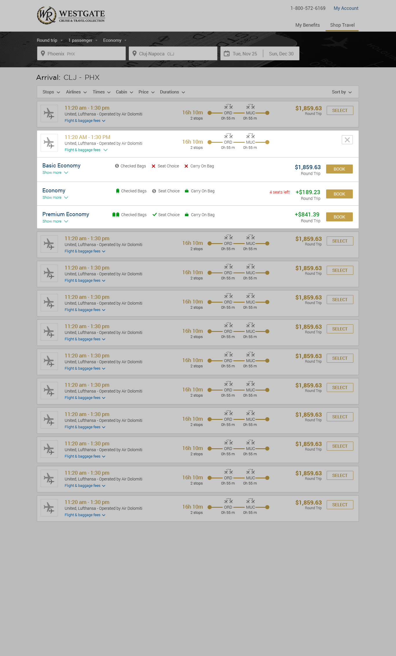
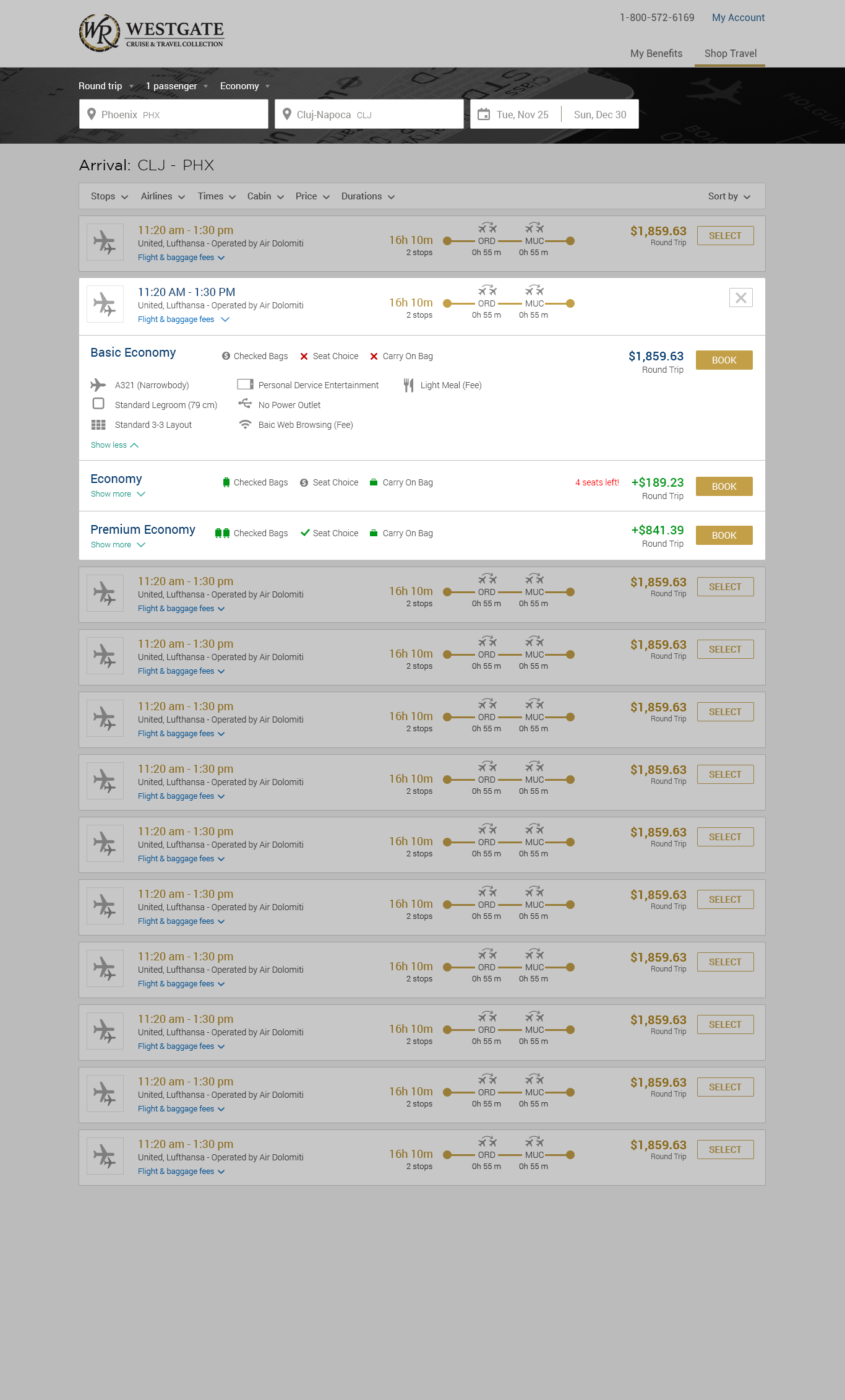
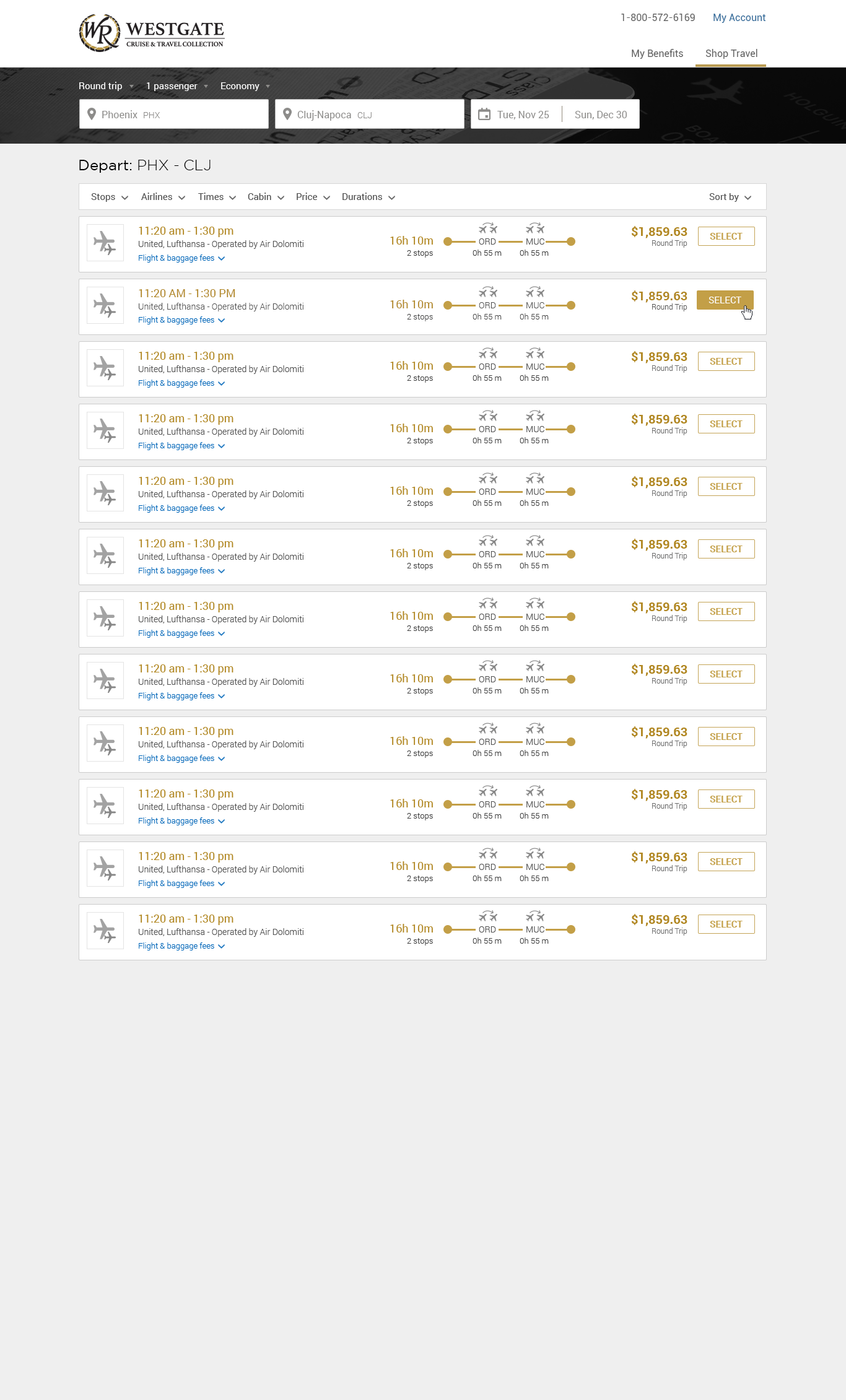
Search Experience Enhancement
Addressing challenges posed by the API data limitations required creative solutions to refine the user experience. One notable issue was the necessity to categorize flight classes by airline. To streamline the user journey and reduce friction, I pared down the displayed information, offering users the option to access more details for each flight as needed. Furthermore, I implemented clear and prominent calls to action at every step, guiding users smoothly through their journey.
-
-
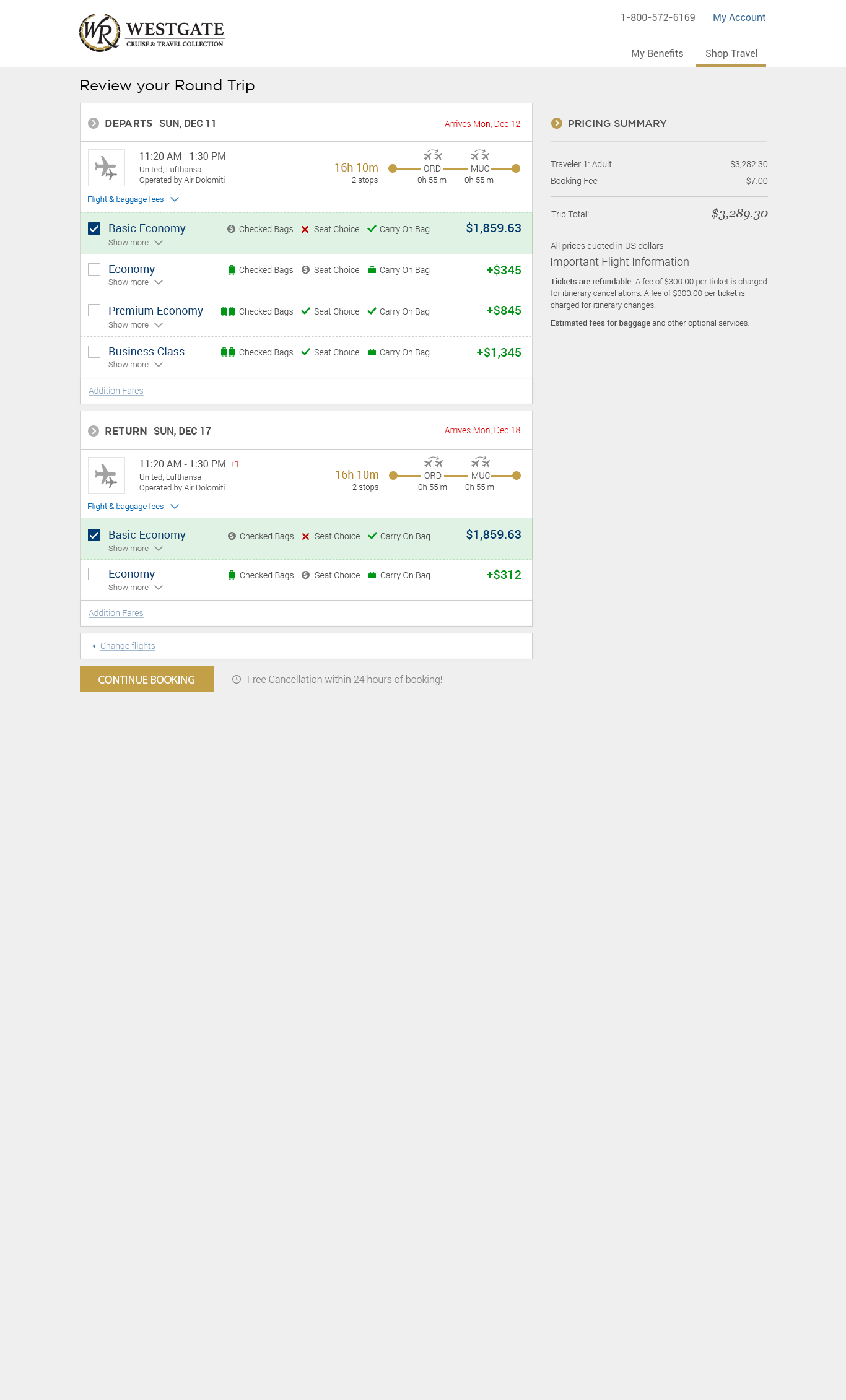
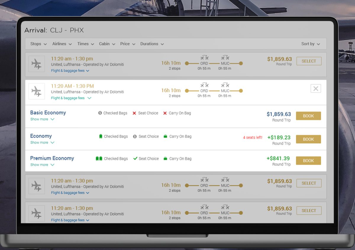
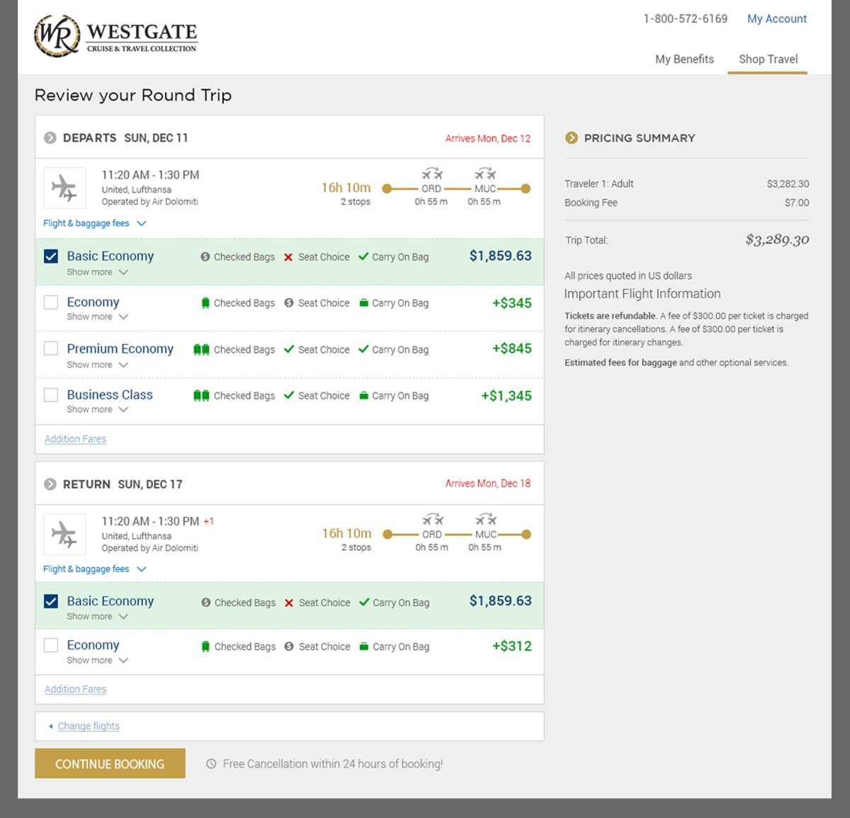
Flight Selection Review
On the review page, users are greeted with a summary of their chosen departure and return flights, along with options to adjust their flight class either upward or downward. Our aim is to motivate users towards opting for a class upgrade by showcasing the cost differential and highlighting the extra advantages this brings.
This page recapitulates the flights selected from the search phase, offering the possibility to modify the flight class. By illustrating the financial variance associated with upgrading and underscoring the supplementary perks, we encourage users to consider enhancing their travel experience.
-
-
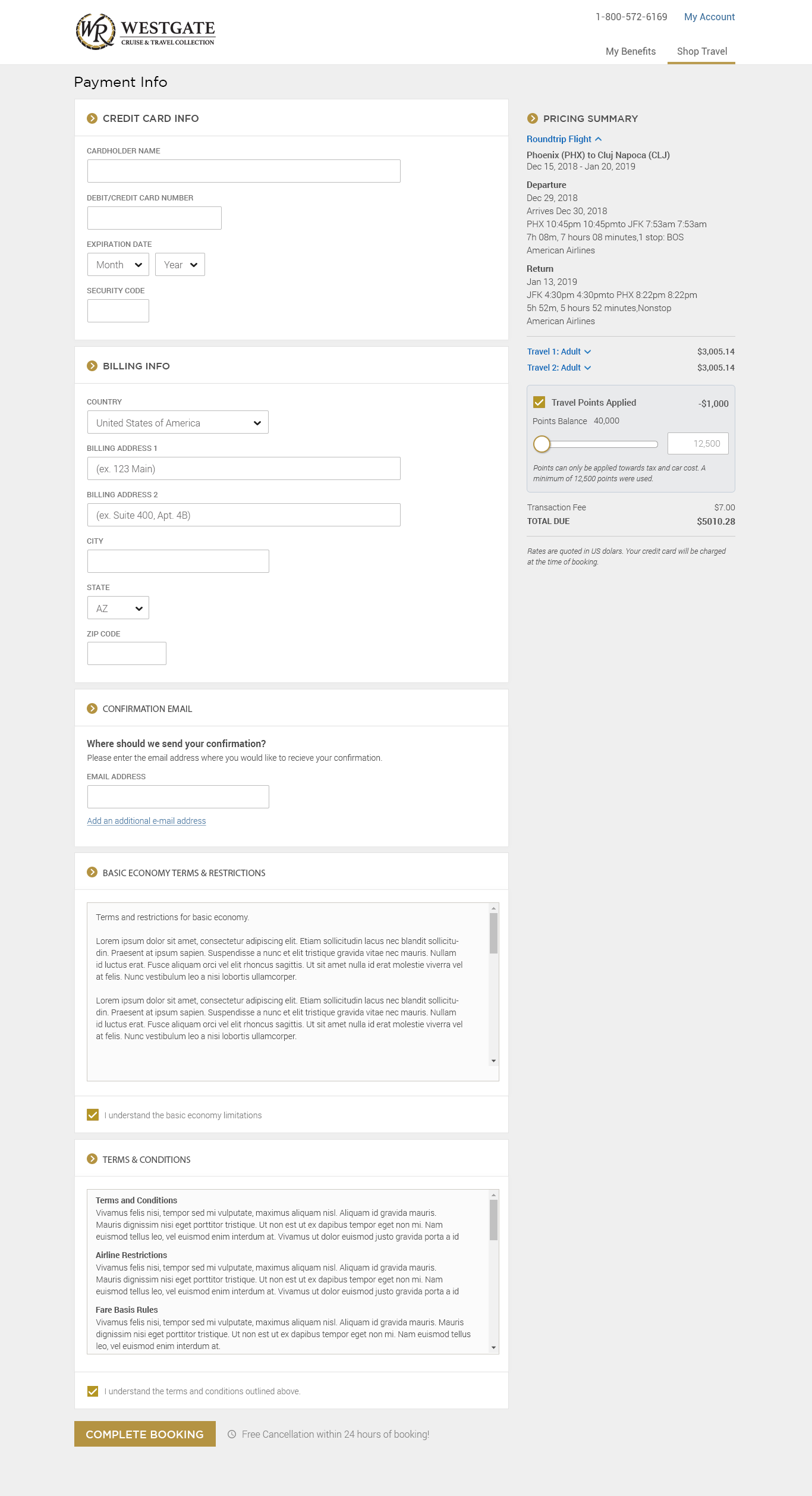
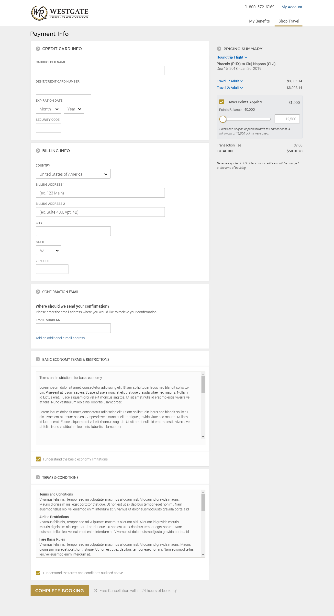
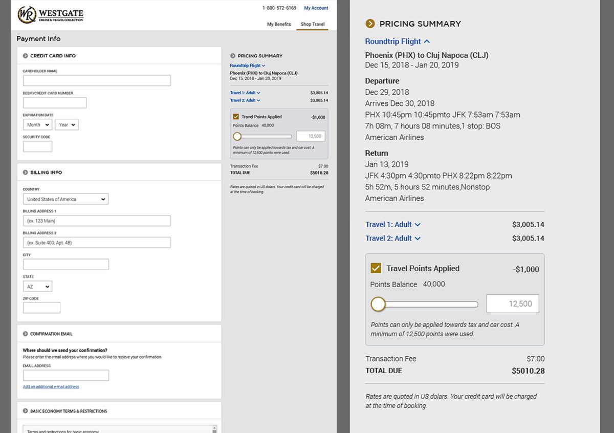
Streamlined Checkout Process
Our goal was to simplify the checkout process as much as possible, reducing the data users need to provide to finalize their booking. To achieve this, we introduced features enabling users to pay using a saved card and select a previously used billing address, thereby streamlining the transaction.
Regarding the use of points towards flight purchases, I incorporated this functionality directly into the display of the total booking cost. A checkbox gives users the option to apply or not apply their points. When activated, the system automatically applies the minimum required points to reduce the total cost, enhancing the user's convenience and experience.
-
-
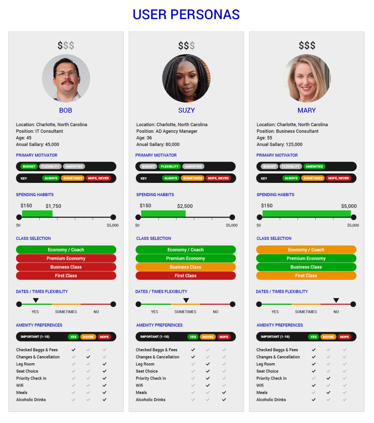
User Personas
For projects that are heavy on features, I like to create user personas to identify the different user types that are going to be using the application. Along with the user personas, I like to create user stories to go along with the personas, describing what type of features they expect to access within the application.
-
-